The graphic below comes from a recent note by Barclays on global trade and requires little explanation. It shows total merchandise trade flows between the world’s main regions in 2012 (above) and 2002 (below).
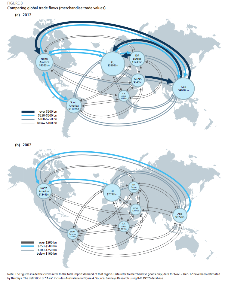
Most obviously, this illustrates the enormous increases in global trade that’s taken place over the past decade. But it also shows a number of significant regional patterns:
- The integration of Asia with the US and Europe
- The integration of Emerging Europe with the EU, but not so much with other regions
- The integration of South America with North America, but not so much with other regions
- The enormous commodity-driven surplus that the Middle East runs with Asia
- The relative isolation of Sub-Saharan Africa
For “Asia”, of course, read “mostly China”.
None of these patterns will be new to anybody interested in emerging markets and their role in the world economy, but this is a very striking representation of them.